Exploring TipKit Framework

Passionate for Apple platform development
TipKit Framework! 💡
One of the exciting announcements from WWDC2023 is the TipKit Framework, and now it is easier to add tooltips for users. I have not tried other 3rd party libraries out there, so I cannot compare some of them here.
If you haven't watched the WWDC23 Session, check it out here:
Make features discoverable with TipKit
TL;DR
My thoughts and personal exploration of the TipKit Framework.
Tips Configuration
// Configure and load your tips at app launch.
.task {
    try? Tips.configure(
        [.displayFrequency(.immediate),
         .datastoreLocation(.applicationDefault)
        ]
     )
  }
}
Creating a Tip View
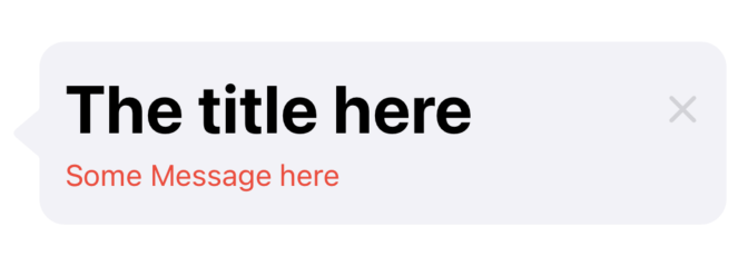
Conform to Tip Protocol
This will require to add title
while message and asset are optionals.
// Define your tip's content.
struct HomeTip: Tip {
    var title: Text {
        Text("The title here")
            .font(.largeTitle.bold())
            .foregroundStyle(Color.primary)
    }


    var message: Text? {
        Text("Some Message here")
            .foregroundStyle(Color.red)
    }


    var asset: Image? {
        Image(systemName: "star")
    }

}
TipView as Popover and Inline View
There are two ways to present the Tip
Popover
In-line (with other Views)
Popover
as the name suggests, it pops over and shows an arrow pointing to where you applied the modifier popoverTip() .
Here, I applied the modifier to the Button labeled "Popover Tip"
let homeTip = HomeTip()
@State private var showPopoverTip: Bool = false

var body: some View {
    Button {
       showPopoverTip = true
    } label: {
       Text("Popover Tip")
    }.popoverTip(homeTip)
}

In-line
this stacks with other views
let homeTip = HomeTip()

var body: some View {
    VStack {
       TipView(homeTip)
    }
}
Customizations
We can also show an arrow with SwiftUI.Edge for TipView()
//Edge has these cases
case top
case bottom
case leading
case trailing
so we can set it like this
TipView(tip, arrowEdge: .leading)
Adding ViewModifiers to TipView
Adding.backgroundColor does not change the TipView color but the container that contains the TipView or beneath it.
We could also add a Shape background.
 TipView(homeTip)
     .padding(16)
     .background(RoundedRectangle(cornerRadius: 25.0).fill(Color.red))
     .padding(16)

ViewModifier .frame()
.frame()
The width can be adjusted to an extent, so as height but not less than the content can show, adjusting these sizes can break the view, so better to use the sizes the way it should be presented.
ViewModifier .padding
.padding()
padding vertically, and horizontally works
ViewModifier .overlay
.overlay()
we can also add like this
TipView(homeTip)
  .padding()
  .overlay(alignment: .bottomTrailing) {
     Image(systemName: "car")
        .font(.largeTitle)
        .foregroundColor(.black)
  }

of course, when we dismiss the Tipview, the overlay disappears as expected
ViewModifier .accessibilityLabel
TipView can be attached with
TipView(homeTip)
  .accessibilityLabel(Text("Home Tip"))
Some Limitations
Inside the Tip View
seems like we can’t attach a ViewModifier for the Image()
var asset: Image {
    Image(systemName: "star")
}
Conclusions
When it comes to showing the Tips UX/UI design-wise, I'll leave it to your exploration.
Other References
TipKit - iOS 17 - SwiftUI - WWDC 2023 by Kavsoft
TipKit - Apple Developer Documentation
